In the past few years, we’ve grown as a company, and so has our customer base—increasing their number of employees, sites, and overall requirements. These larger organizations use Bob to run more complex processes and use more of Bob’s data to measure their progress and successes.
As VP Design (Product) at HiBob, I am dedicated to providing our customers with a superior user experience (UX), ensuring that Bob’s look and feel continue to evolve in line with market needs and trends. Our friendly and welcoming design differentiates us from other HCMs and is essential to defining who we are as a company and the unique product we provide for our customers.
If we look at the basics, Bob’s design is based on four principles that guide us to deliver an intuitive and friendly HCM. These are clarity, efficiency, consistency, and beauty.
- Clarity: This is the most important principle. When you enter Bob, you should experience a smooth journey and understand what you need to do and where to navigate to get the results you are looking for.
- Efficiency: This is a must-have for SaaS applications like Bob. An efficient HCM helps HR leaders, managers, and employees to do their jobs better and faster.
- Consistency: This is essential for our customers as they take different paths throughout the platform. Providing a consistent user interface is critical to a successful user experience.
- Beauty: This is reflected in our UI, illustration, and typography. Our customers love Bob’s look and feel, which helps us stand out from the crowd.

These four principles guide us as we strive to support our customers as they grow by offering expanded capabilities and a more streamlined journey for using Bob’s different modules. We want to deliver clarity, consistency, and efficiency while never compromising beauty. With this in mind, we have given Bob a new look to provide the best user experience for our customers everywhere.
Enhancing Bob’s UX and UI
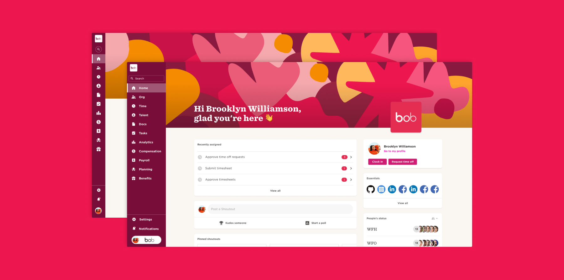
The first point we addressed when enhancing Bob’s UX was providing our users with an expanded workspace when working with Bob. Whether you want to view dashboards, run reports, or make compensation decisions, we understand that having a larger work area is invaluable for increasing efficiency. To make this possible, we made additional modifications to the Bob interface. These include:
- Making a clear definition between the left and right areas of Bob
Before, there were navigation elements in a few areas of Bob, leaving a smaller workspace in the center. Now, we’ve moved all of the navigation to the left and the workspace to the right, aligning with the natural way most people consume content, reading from left to right.
- Maximizing the available workspace in Bob
In the previous version of Bob, there was a background image around the workspace, which we removed to maximize the available area. We also moved the menu to the far left side of the screen and extended the workspace to the far right side, providing a larger workspace for you to work.
- Creating a more accessible navigation bar
Our new navigation provides a more accessible experience for people with low vision or color blindness. There is always a high contrast between the text/icon and background, and you can maximize the navigation bar to view the full names of the modules or minimize it to create a larger workspace with less distraction from the navigation.
- Designating one area for navigation
In the previous version of Bob, the profile, search, and settings were located on the right side, with the rest of the navigation on the left. We have moved these items to the left menu so that all the navigation is in one designated area and there is more available workspace on the right side.
We’ve also made additional changes to Bob to enhance the user experience. In research we conducted with our users, we learned that the settings were not organized in a user-friendly way. So, we’ve reorganized them so that the settings for each module are found in the relevant module area rather than at the company settings level, making it easier and more intuitive for you to find what you are looking for.
Addressing low-vision accessibility in Bob
As we work to improve clarity, efficiency, consistency, and beauty across the Bob platform, we are also invested in addressing accessibility for our customers, focusing first on low-vision accessibility. We are addressing ways to make Bob more accessible for people with low vision and color blindness in line with our company mission of inclusivity and industry standards. As part of this undertaking, we have:
- Replaced the multi-color menu with a single color.
- Increased the basic font size throughout Bob from 12px to 14px and the larger font size from 14px to 16px.
- Increased the contrast between the text color and background for the menu and buttons across Bob.
- Provided color palette options that are low-vision accessible.
- Created color rules for all the buttons across Bob (primary, secondary, and tertiary) to ensure high contrast and preserve the hierarchy.
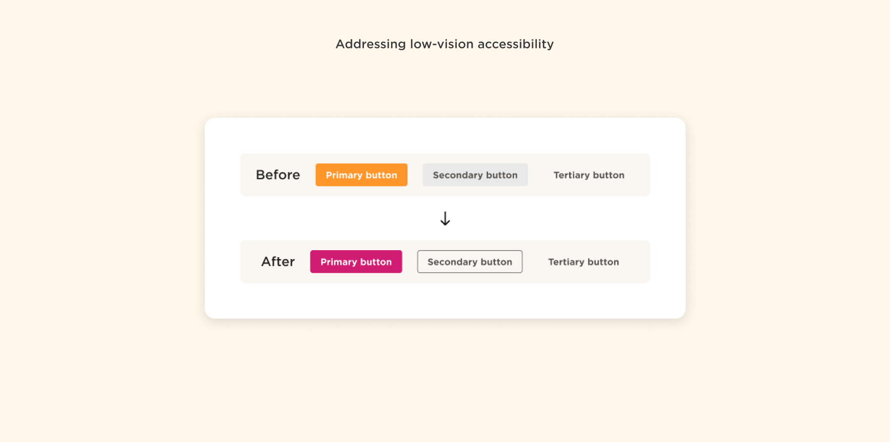
We are also working on making Bob compliant with WCAG 2.2 (Web Content Accessibility Guidelines) standards as part of our commitment to making our platform more accessible.
Creating a branded environment for our customers
Two years ago, we started offering the option to brand Bob in your company colors and add your logo and background image to inspire a sense of belonging for your people. This has proven very successful, as over 50 percent of our customers have chosen to white-label Bob this way.
We’ve expanded this capability, adding a new “Pop style” color palette to the existing “Bob style” palette. This new palette includes generic colors, enabling you to create graphs and labels in colors that align more closely with your company brand. We’ve also created some guidelines around color and branding that ensure efficiency and low-vision accessibility across the platform.
How does this change your Bob experience?
- When adding your custom background image to Bob, you will only see it as a banner in the home tab and not down the sides, preserving a larger workspace for working in Bob.
- When you enter Bob, your company logo and background image will appear on the Bob homepage to provide a sense of belonging for your people. As you explore Bob’s modules, they will disappear, giving you an expanded workspace to complete your tasks and increase efficiency.
Recommended For Further Reading
Keeping Bob fun and friendly
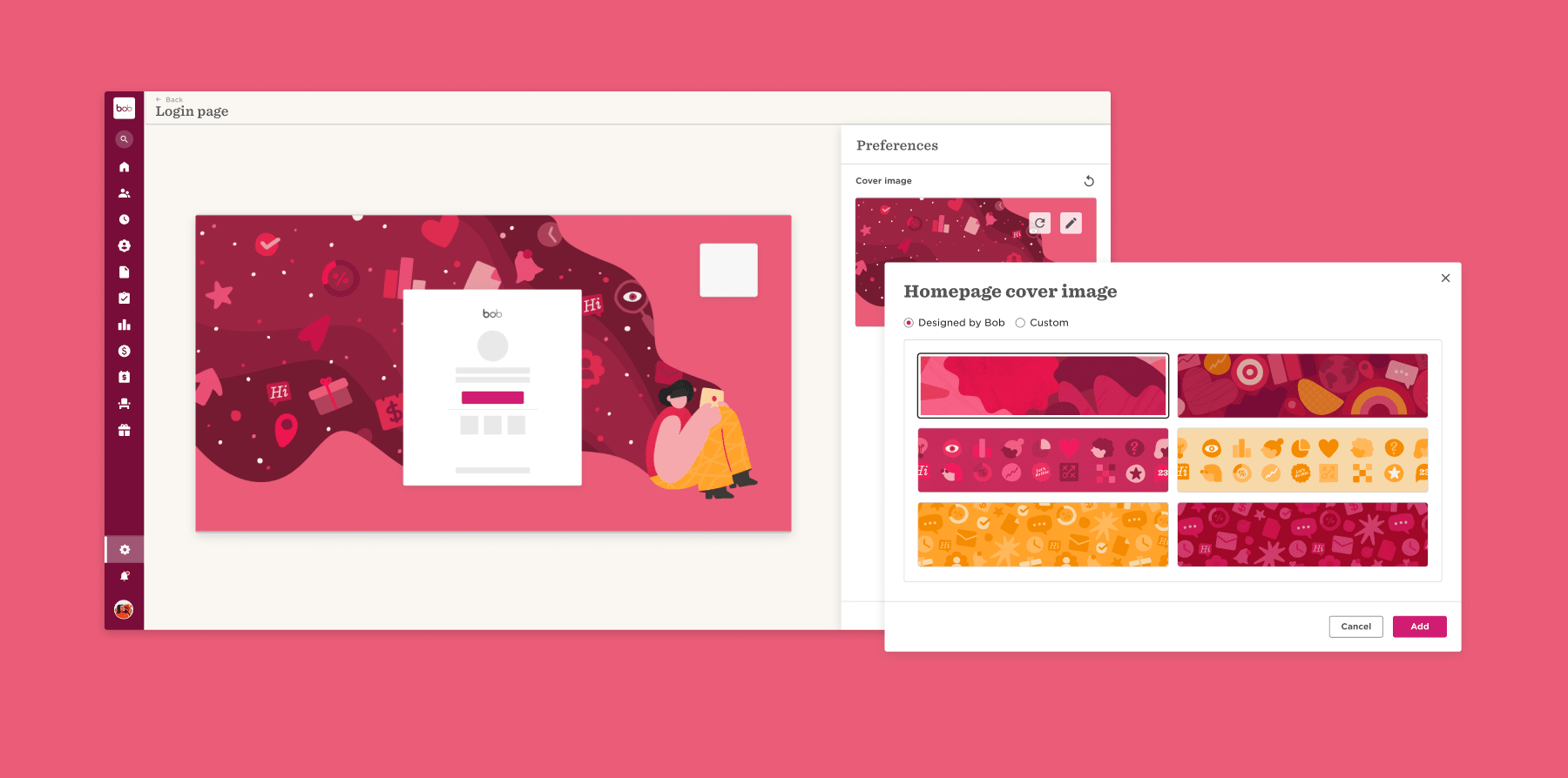
Our fun and friendly design is something our customers love, and we want to keep it that way. As part of Bob’s new look, we’ve added Bob brand identity elements in the form of shapes and illustrations across the platform. These unique elements help us communicate product features in a simple and inviting way. You will see them on the login page, homepage, and when you start a new project or use a module for the first time, adding a fun and fresh touch. We are also building a library of cover images that you can use and switch up for different milestones, seasons, or to reflect your company values.
Bob is your platform
We know you love Bob, but we wanted to make it even better! As our company has matured and our customers have grown in size and Bob usage, we knew it was time to give Bob a makeover. We work in partnership with our customers and have taken what we’ve learned to make Bob’s user experience more streamlined, efficient, intuitive, and accessible for our global customers. We love Bob’s new look and hope you do too.

From Shmulik (Sam) Albo
Sam is VP Design at HiBob. With over 15 years of expertise in product design and user experience web projects, he consistently brings product concepts to life that look simple and beautiful.