The world of HR has undergone significant evolution and transformation since the inception of HiBob back in 2015. As an organization, we have always aimed to build a modern, global platform that puts HR at the center of the business, allowing impact at every level and putting people first.
Our brand embodies our story, values, and character, aligning with the principles we hold dear. As the world of work has evolved over the years, so has our brand. We have adapted to the changes and continue to set ourselves apart by staying true to our core values.
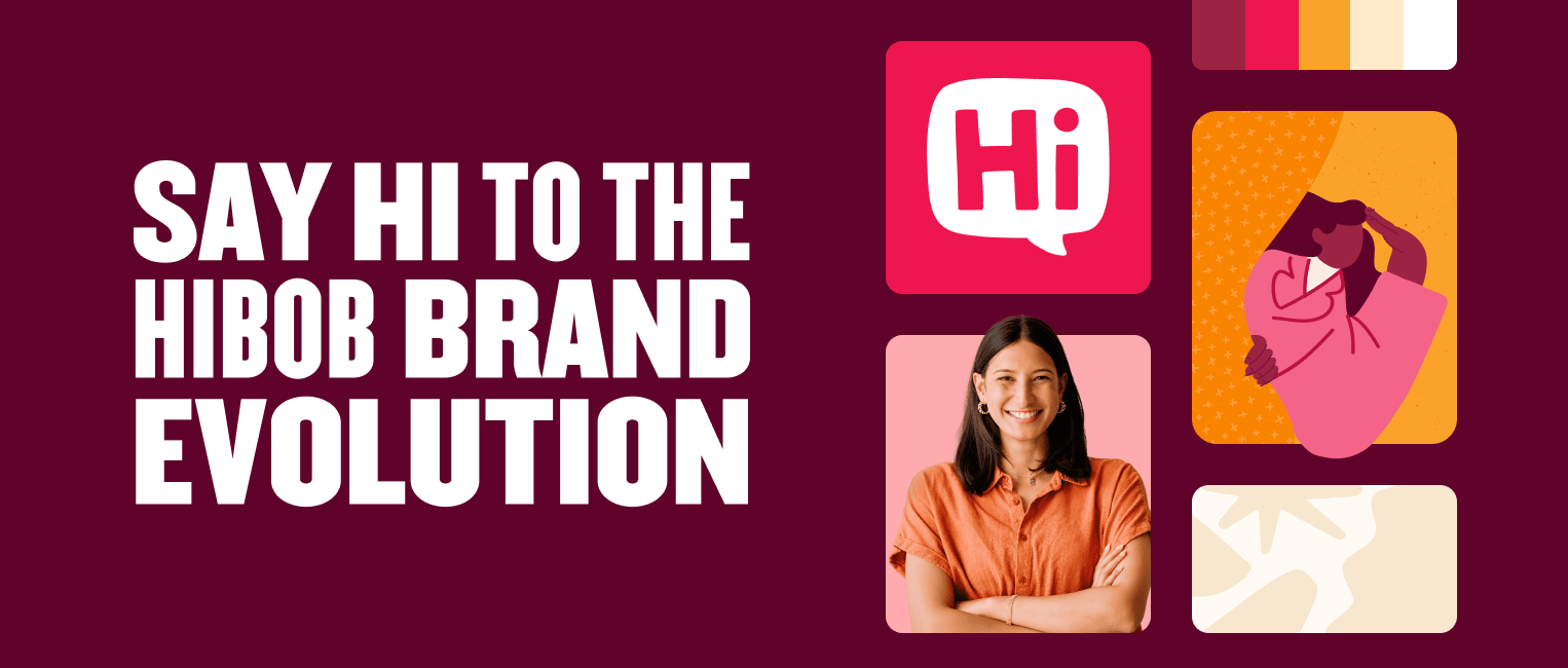
Today, I’m excited to unveil the next chapter in our journey, including a brand new HiBob logo. The new design aims to modernize our brand identity system, reflecting our company’s growth and innovation while preserving our core values and brand equity.
A new functional, flexible, and fun HiBob logo
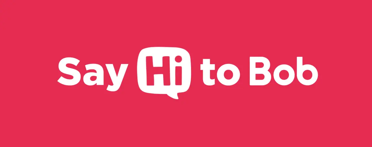
Our logo is the hallmark of our company, our brand, and our people across every channel, everywhere. We realized that our older “bob” logo no longer aligned with the needs of our brand and the values that we align to in a modern design system. It was also creating confusion for customers and prospects. “Is the name of your company Bob? Is it HiBob?”
To set the record straight, the name of our company is HiBob. And we needed a logo that made that crystal clear. So, we focused on three guiding design values as we set out on this project: functional, flexible, and fun.
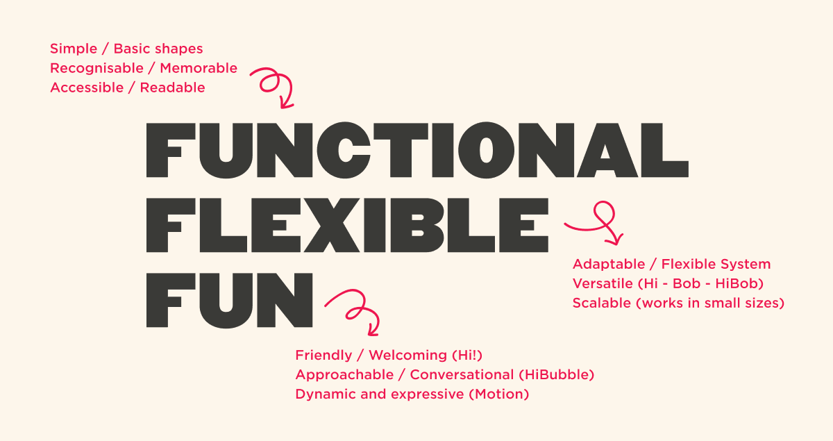
Functionally, we needed to make sure that we had a logo that reflected the name of our company (HiBob) and not only the name of our platform (Bob). We also needed to make sure that the capitalization of the letters in this logo reflected exactly how we write our company name, with a capital “H” and a capital “B.”
We also needed the new logo to be flexible, working well as a complete HiBob logo, as well as in smaller versions (such as just the “Hi” or just the “Bob”). This way, we could maintain consistency across all of our materials, platforms, and channels.
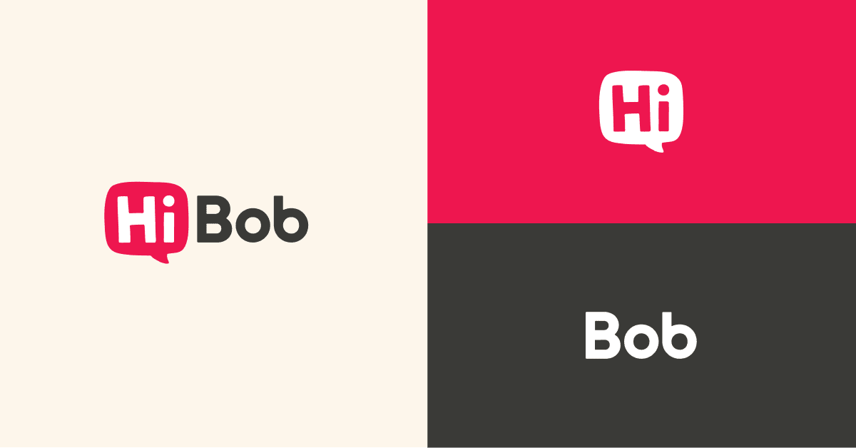
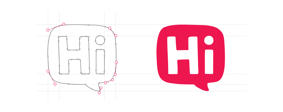
Finally, we needed to maintain the value of “fun” within our logo. The “Hi” in “HiBob” plays a huge role in our company values. It is how we make our brand human, welcome everyone into our village, and represent our playful spirit and inclusive communication between people everywhere, from every background. We chose to put the “Hi” center stage in a hand-drawn, imperfect HiBubble that is as unique and diverse as the people we serve.
Our brand is more than just a logo
We take immense pride in the way our brand has developed over time and the unique identity we have established in the market through our dynamic design system, including our color scheme, typography, illustrations, and photography. Along with redesigning our logo, we also reviewed all other aspects of our brand to ensure we’re building a cohesive brand language that aligns with our brand story.
Recommended For Further Reading
Colors and shapes
Our brand colors and shapes play a foundational role within our design system. Our color combinations have always been vibrant and flexible. However, in this evolution of our brand, we wanted to expand our color palette into a broader range of tints and shades. Tints and shades give us even more flexibility and allow us to add more depth to our visuals. Additionally, we now have the ability to use tonal variations to create better accessibility through more contrast in our work.
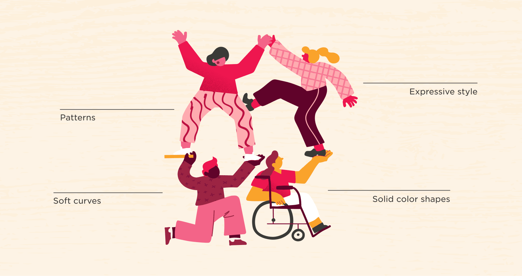
At the same time, our shapes are carefully crafted to be unique and expressive. We prefer rounded shapes and soft curves because they communicate approachability and warmth, consistent with our human-centered design philosophy.

Typography and imagery
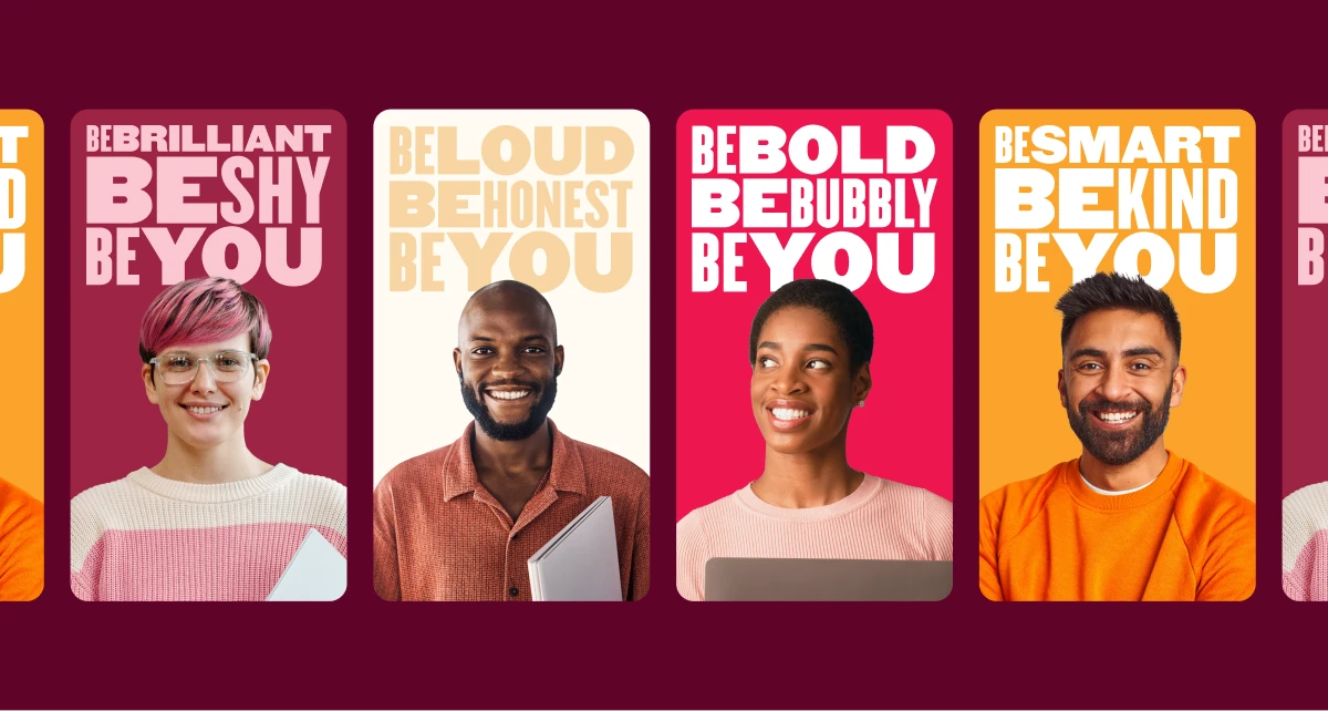
Typography and imagery play a significant role in defining our brand’s identity and character. We use both to represent and connect with a diverse audience in each piece of work we create.
Our three typefaces with varying weights work together to express our unique personality and adaptable culture. Our font collection is clear, accessible, and represents our commitment to diversity and inclusion of every team member. Our images also feature people with natural expressions, and we use models that represent real people—diverse, friendly, and authentic.
Illustrations, textures, and patterns
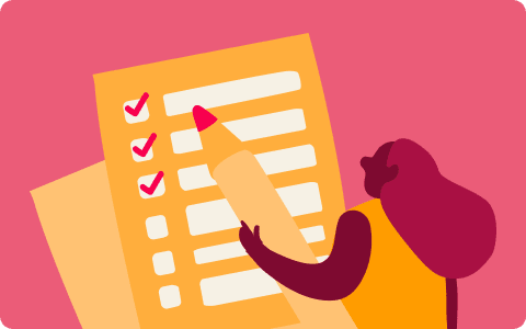
Illustration plays a key role in our brand identity. It’s a powerful tool for storytelling that enables us to convey our warm, vibrant personality in a creative and flexible way. We use illustrations to bring our brand to life and communicate abstract concepts in a fun and relatable manner.
We also use textures to convey the identity and personality of our brand. Textures add depth and tactile appeal, contributing to people’s overall visual experience with our brand. Our textures are inspired by the materials surrounding us in the everyday work environment. They’re a part of the organic and ever-changing world around us.
Patterns are an essential part of our illustration style. They help us create vibrant and multi-layered images that enrich the stories we tell. Our visual language uses patterns to express moods and direct the viewer’s attention to specific elements in each illustration.
What’s next?
We will be rolling out our new logo and brand evolution in a thoughtful, phased digital and physical approach. We feel strongly about not creating more waste, so we have chosen not to throw away materials with our old logo. Instead, we will continue to use things we already have printed and only create new materials as needed.
We hope our new logo and evolved brand expression will make everyone feel welcome and connected to us, not just as a brand but as people who care deeply about people. Just as the world of work will continue to evolve, we will, too.
For more details, you can take a look at our fully updated brand guidelines here.