
When finance leaders reflect on their careers, the advice they’d give their younger selves rarely has to do with perfecting Excel models or technical analysis. Instead, they emphasize the importance of building strong business partnerships, honing communication skills, and mastering the art of financial storytelling.
Visual tools play an important role in that storytelling. Waterfall and bridge charts, for example, have long been staples for helping finance teams translate complex insights into something business partners can quickly understand. One of the most common applications is the revenue bridge chart.
While simple in design, a revenue bridge chart can be a powerful output of your revenue forecasting process. It not only clarifies what’s driving changes in revenue but also helps strengthen trust and collaboration with stakeholders across the business.
What is a revenue bridge?
A revenue bridge is a data visualization that breaks down the different components of a revenue forecast, making it easier to show the specific drivers behind top-line growth.
Revenue bridge charts—sometimes called ARR bridge charts in the SaaS world—have been a go-to tool for helping finance teams present forecast data to both financial and non-financial stakeholders. They’ve become even more common since Microsoft Excel introduced built-in waterfall charts in 2016, making this type of visualization more accessible.
<<Download our bundle of pre-built financial waterfall model and chart templates.>>
What does a revenue bridge chart show?
Like other bridge or waterfall charts, a revenue bridge shows a starting value, an ending value, and all the steps in between that explain how you got from A to B.
In the case of an ARR bridge chart, the Y-axis represents ARR totals, while the X-axis shows the different components that add up to your ending ARR for the period. These typically include:
- Starting ARR: The total bookings at the beginning of the period, based on combined ACV for all closed-won deals
- New ARR: Bookings from new deals signed during the period
- Renewal ARR: Bookings from customers who renewed their contracts
- Upsells: Bookings from existing customers who expanded their contracts
- Churned revenue: ARR lost from customers who left
- Downgrades: ARR lost from customers who reduced their contracts
- Ending ARR: The final bookings value after all movements are factored in
Whether you build the bridge using floating bars or filled bars, the goal is the same: a clear visualization of the revenue journey from starting to ending ARR.
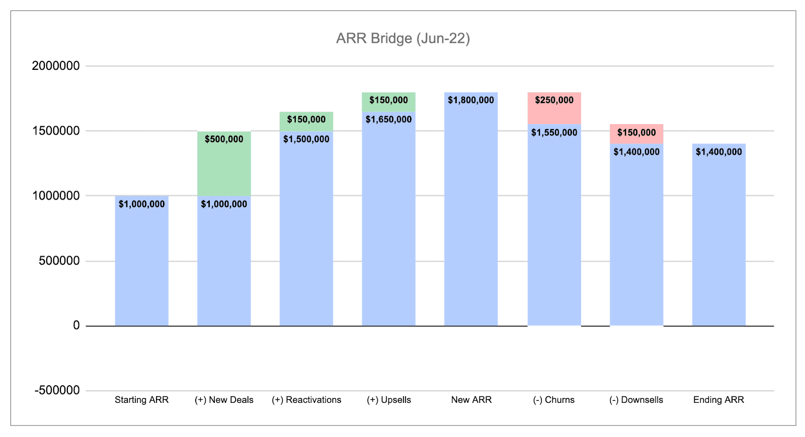
The chart displays changes between each stage so you give business owners, executives, and stakeholders visibility into the different components of top-line growth.
How to create a revenue bridge chart
Revenue bridge charts may look simple, but building them consistently month after month (or quarter after quarter) can take time.
If you want to skip the process altogether, download our ARR bridge chart template.
If you prefer to create your own from scratch, here are the high-level steps:
1. Build your data table
Start with a data table that includes the key components we outlined earlier, plus columns for the baseline value, decreases, increases, and the delta.
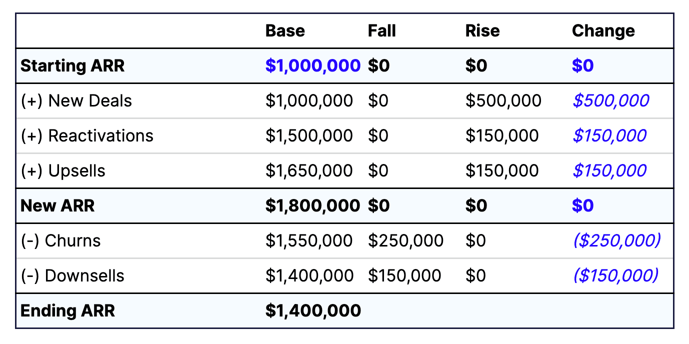
If you’re building a standalone revenue bridge, you’ll need to hardcode the base value and changes. From there, you can calculate the rest so your table shows all increases and decreases in revenue.
Recommended For Further Reading
2. Create a waterfall chart or stacked column chart
Once your table is complete, use Excel or Google Sheets to create the visualization.
- In Excel, you can select the built-in waterfall chart option and then customize it
- In Google Sheets, there’s no waterfall option, so you’ll need to build a stacked column chart and adjust the formatting to achieve the bridge effect
3. Customize formatting and visualization options
The overall concept of a revenue bridge is the same everywhere, but formatting can make it more effective for your audience. For example:
- Add data labels to make it easier to see the size of each increase or decrease
- Use color-coding to highlight positive versus negative changes
- Adjust colors and layout to match brand guidelines or presentation standards, especially for executive or board updates
Why spreadsheet-based bridge charts aren’t ideal for financial analysis
Just because ARR bridge charts are a long-standing tool in financial analysis doesn’t mean spreadsheets are the most effective way to build or share them. There are a few limitations to keep in mind:
- They’re not dynamic. A basic bridge chart shows how you move from starting to ending ARR, but it doesn’t let you drill deeper into account-level details when stakeholders want more context.
- They go stale quickly. Because spreadsheets require manual updates, your charts are only as fresh as the last time you pulled data. By the time the chart is updated, the insights may already be outdated.
- They’re out of context. A standalone chart exists separately from the rest of your financial data. And if you embed it into a larger model, you increase complexity and the risk of errors.
The goal of a revenue bridge is to help you explain the “why” behind the numbers in a way that stakeholders across the business can understand. Spreadsheets can do the job, but they often demand more manual effort and offer less clarity than modern financial tools designed for real-time analysis and collaboration.
Use our revenue bridge chart template to get a head start
Don’t spend hours (or days) every month trying to get your ARR bridge formatting just right.
Download our spreadsheet-based revenue bridge chart template to get started faster. And streamline your other waterfall use cases by downloading our other templates:
- SaaS revenue waterfall model
- P&L + headcount model
- Bookings to revenue waterfall model
- Financial waterfall template
Frequently asked questions
What is an ARR bridge?
An ARR bridge is a type of revenue waterfall chart that shows how starting ARR moves to an ending value. It breaks down the impact of new ARR, renewals, upsells, downgrades, and churn to give a clear picture of what’s driving changes in recurring revenue.
What does an EBITDA bridge show?
An EBITDA bridge illustrates how EBITDA changes from one period to the next. It accounts for shifts in recurring and non-recurring revenue, gross profit, and expenses across functions like sales, marketing, R&D, and G&A. This type of bridge is often used by more mature companies and financial analysts to better understand overall financial health.